TULE GASTRO bar
TULE GASTRO bar
KEYWORDS / BRAND IDENTITY / PRINT DESIGN / LOGO DESIGN / RESTAURANT / MEXICAN / REGIONAL CUISINE / POPULAR CULTURE / GERMANY / FOREIGN

THE CLIENT
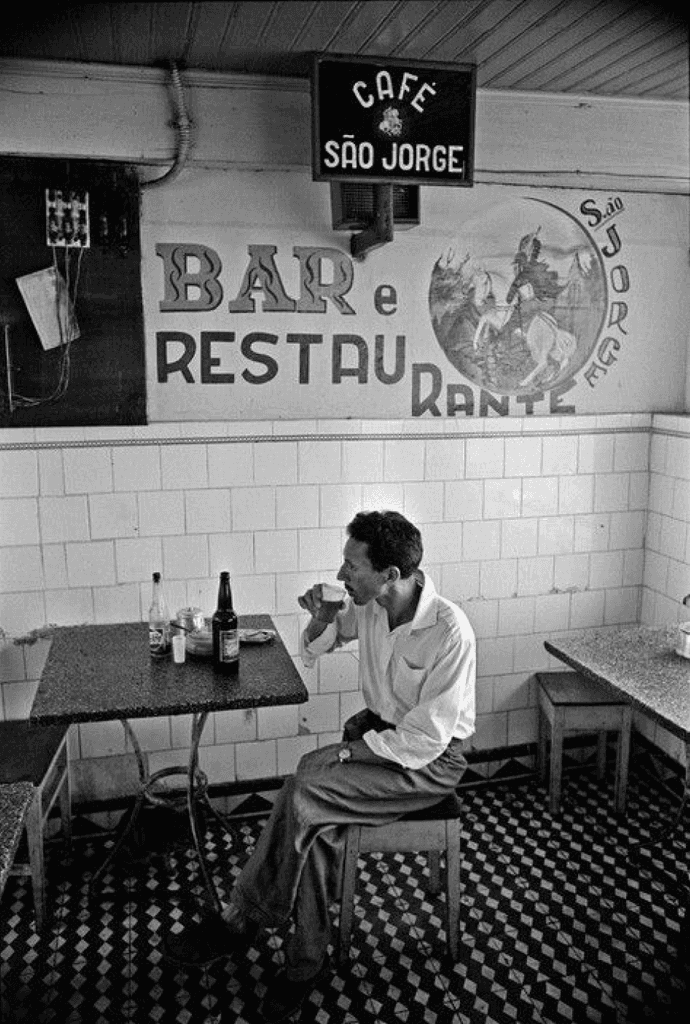
Tule Gastro Bar is an upcoming Mexican restaurant nestled in the heart of Nuremberg, Germany. It was founded by three lifelong friends from Mexico, two of whom had independently moved to Germany, and one who relocated specifically to bring this culinary vision to life.
Taquería Madre celebrates authentic Mexican cuisine in an elevated way while carefully crafting their dishes to share with friends alongside classic drinks. The owners, being Mexican, discovered that the international food scene in the beautiful city of Berlin is amazing, but the mexican cuisine is lacking attractiveness and authenticity.
Taquería Madre celebrates authentic Mexican cuisine in an elevated way while carefully crafting their dishes to share with friends alongside classic drinks.
United by deep-rooted cultural pride, familial traditions, and a shared love for Mexican cuisine, the trio set out to create a space that would not only serve food but also narrate the rich, diverse tales of their homeland.
Taquería Madre celebrates authentic Mexican cuisine in an elevated way while carefully crafting their dishes to share with friends alongside classic drinks.

THE OBJECTIVE
The primary goal of the branding project was to develop a visual identity that embodies authenticity, storytelling, and cultural reverence. Tule Gastro Bar needed a brand that would resonate with both local German patrons and the broader international community,
Develop a brand identity, collaterals and a website that harmoniously and effectively communicates the taquería's value and experience to Berliners, as well as the Mexican
view of the taco as something "holy".
The primary goal of the branding project was to develop a visual identity that embodies authenticity, storytelling, and cultural reverence. Tule Gastro Bar needed a brand that would resonate with both local German patrons and the broader international community,
something modern yet steeped in the folklore and textures of Mexican heritage. The identity had to evoke warmth, heritage, and a strong sense of place, while remaining approachable and relevant in a European gastronomic landscape.
Through the brand's behavior, typography and color story, the essence of true authentic Mexican taquerías is captured in an elevated way. Taquería Madre seeks to be a place where you can enjoy a genuine Mexican experience and share classic drinks with friends.
Through the brand's behavior, typography and color story, the essence of true authentic Mexican taquerías is captured in an elevated way. Taquería Madre seeks to be a place where you can enjoy a genuine Mexican experience and share classic drinks with friends.


THE SOLUTION
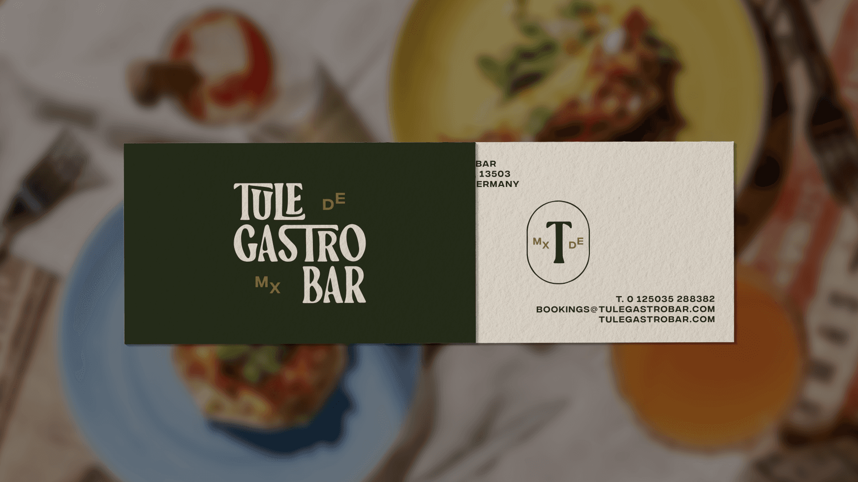
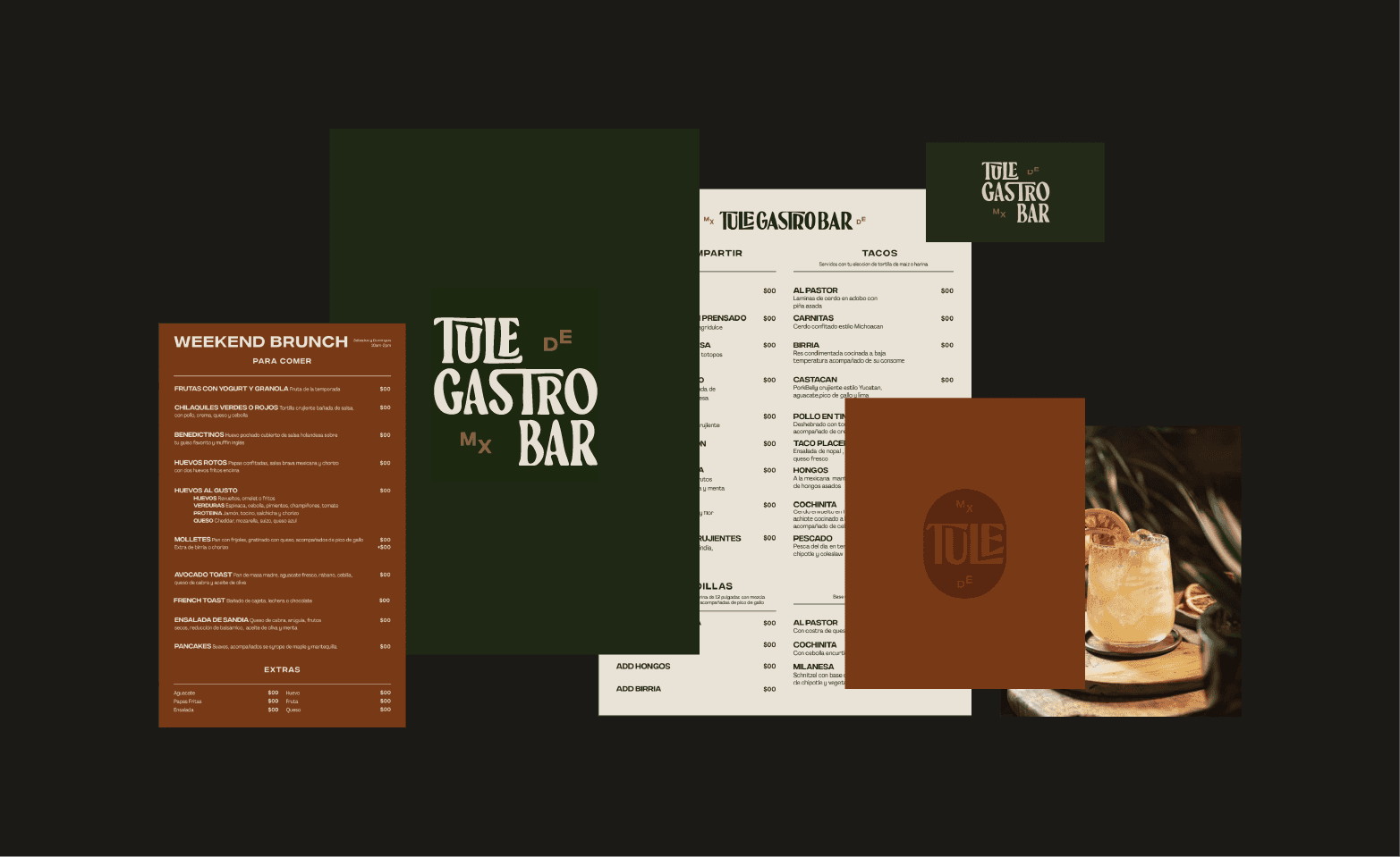
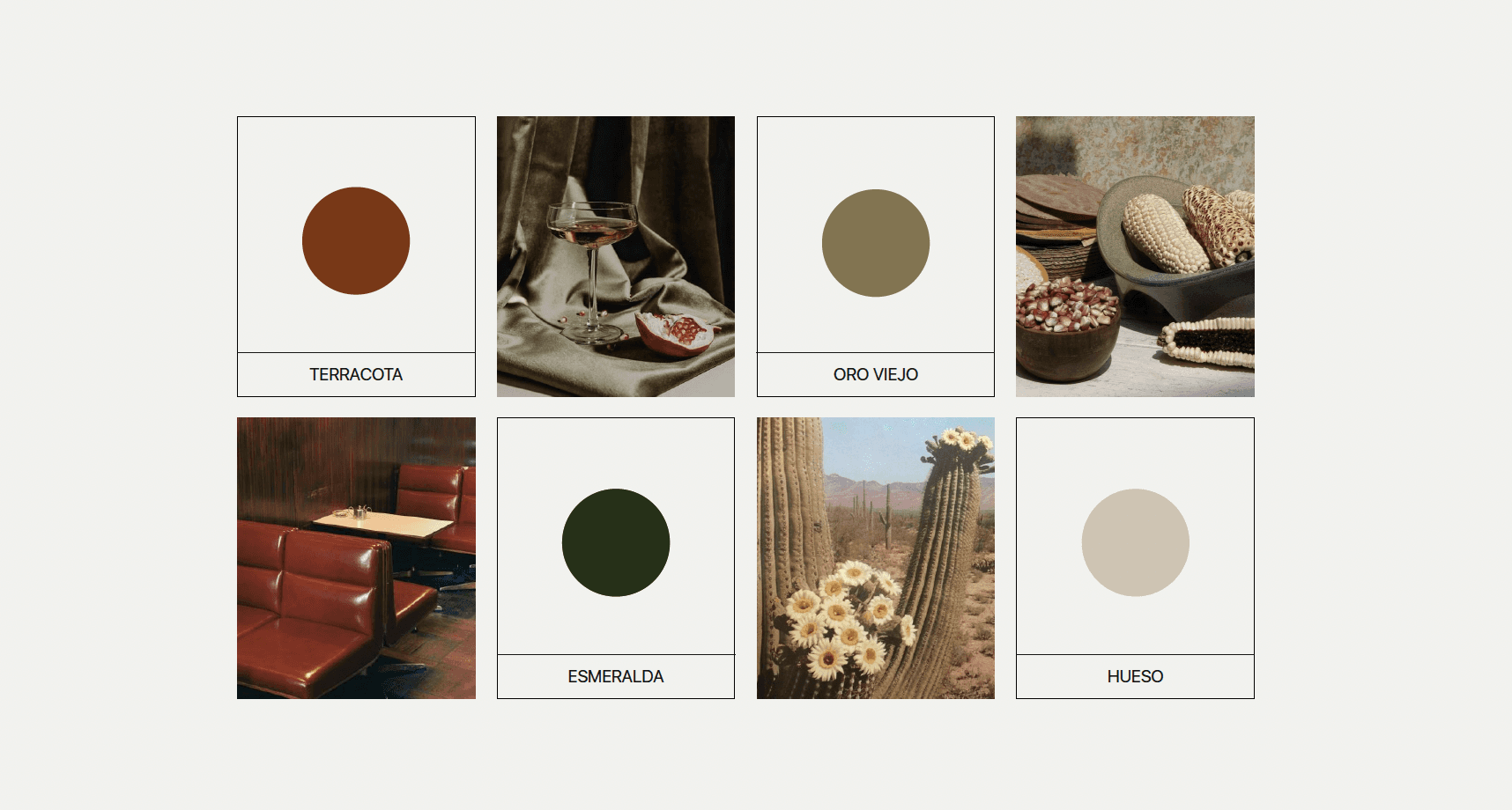
Drawing from a rich visual library of Mexican history, craft, and typography, the branding system was constructed using a palette of earthy tones, expressive typefaces, and rustic textures. The logo merges handcrafted typographic forms with contemporary composition, capturing the spirit of a new culinary tale grounded in tradition.
The logo is composed of a wordmark,
mixed in 2 different fonts inspired by street
taquerías of various regions in Mexico. Their communication and collaterals tend to be very rough, rustic and sometimes handmade. The brand illustrations and colors are a user-friendly way of depicting how vibrant the food is, and how much Mexicans put tacos, chiles and mezcal in a pedestal.
The logo is composed of a wordmark,
mixed in 2 different fonts inspired by street taquerías of various regions in Mexico. Their communication and collaterals tend to be very rough, rustic and sometimeshandmade. The brand illustrations and colors are a
user-friendly way of depicting how vibrant the food is, and how much Mexicans put tacos, chiles and mezcal in a pedestal.
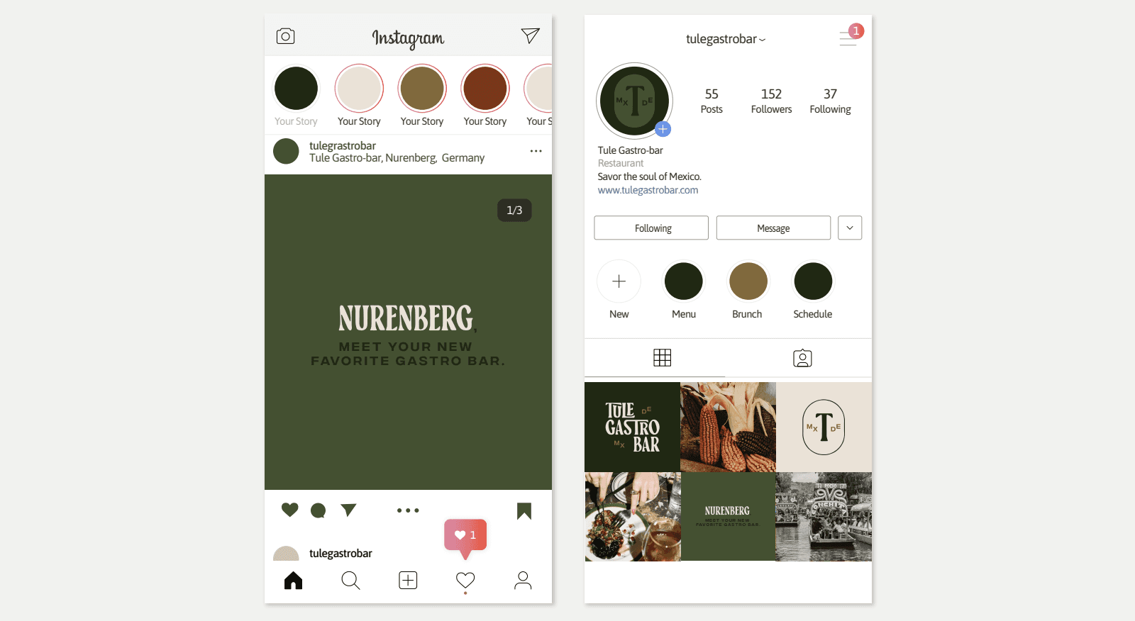
Supporting visuals like vintage photography, bold typographic treatments, and folkloric symbols create a tactile and immersive brand world. The brand identity extends across print, signage, and digital, designed to seamlessly complement both the dining atmosphere and the broader brand narrative.
The Typefaces used are modified in the wordmark, originating from the act of street vendors modifying and adapting graphic elements and fonts to their needs, sometimes without contemplating if it's correct or not.
On the restaurant's communication and website, we aim to reflect the personality of this culinary experience, all while carefully considering the target audience and their needs. Details and simplicity are key
in taking this into action.
The Typefaces used are modified in the wordmark, originating from the act of street vendors modifying and adapting graphic elements and fonts to their needs, sometimes without contemplating if it's correct or not. On the restaurant's communication and website, we aim to reflect the personality of this culinary experience, all while carefully considering the target audience and their needs. Details and simplicity are key in taking this into action.