NUMA STAYS
NUMA STAYS
KEYWORDS / GRAPHIC DESIGN / HOSPITALITY / TECH / ILLUSTRATION / TRAVEL / EUROPE / LIFESTYLE / WAYFINDING
ABOUT NUMA
During my 2.5 years as a graphic designer at Numa, I supported a fast-scaling hospitality tech brand that’s redefining the guest experience across Europe. Numa combines boutique-style stays with seamless digital experiences, replacing traditional hotel hassles with smart, design-driven solutions. I contributed to visual storytelling across multiple touchpoints—helping shape a cohesive, modern identity that matched the brand’s mission: delivering frictionless, memorable stays in some of Europe’s most exciting neighborhoods.
During my 2.5 years as a graphic designer at Numa, I supported a fast-scaling hospitality tech brand that’s redefining the guest experience across Europe. Numa combines boutique-style stays with seamless digital experiences, replacing traditional hotel hassles with smart, design-driven solutions. I contributed to visual storytelling across multiple touchpoints—helping shape a cohesive, modern identity that matched the brand’s mission: delivering frictionless, memorable stays in some of Europe’s most exciting neighborhoods.
During my 2.5 years as a graphic designer at Numa, I supported a fast-scaling hospitality tech brand that’s redefining the guest experience across Europe. Numa combines boutique-style stays with seamless digital experiences, replacing traditional hotel hassles with smart, design-driven solutions. I contributed to visual storytelling across multiple touchpoints—helping shape a cohesive, modern identity that matched the brand’s mission: delivering frictionless, memorable stays in some of Europe’s most exciting neighborhoods.
Key Responsibilities / Visual Design / Cross-team collaboration /
Illustration / Digital Marketing / Wayfinding Strategy /
Motion Design / Digital and Print design / Social Media Content
In Collaboration with the Brand, Marketing and Operations teams at numa.


MY ROLE AT NUMA
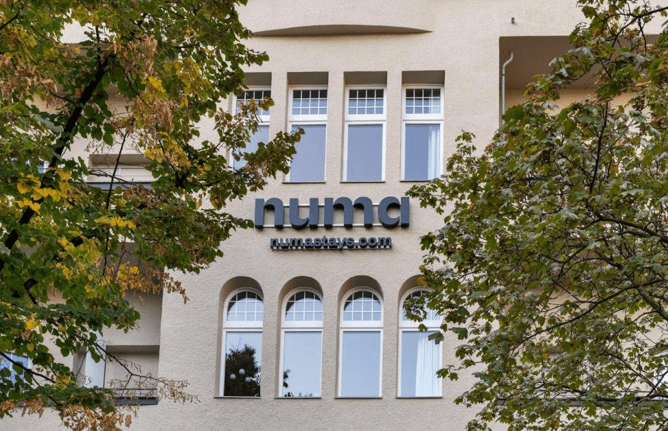
My work spanned the creation of both digital and printed brand collateral, marketing campaign assets, and illustrations that brought warmth and personality to the brand. I was also heavily involved in the development of signage for Numa properties across Europe, collaborating closely with the operations teams to bring these systems to life across various locations, ensuring consistency and impact in diverse architectural contexts.
My work spanned the creation of both digital and printed brand collateral, marketing campaign assets, and illustrations that brought warmth and personality to the brand. I was also heavily involved in the development of signage for Numa properties across Europe, collaborating closely with the operations teams to bring these systems to life across various locations, ensuring consistency and impact in diverse architectural contexts.
Additionally, I supported print production and asset rollout, helping translate brand values into both tactile and large-scale physical experiences. This role allowed me to merge thoughtful design with real-world application, contributing to a hospitality experience where every visual detail felt intentional and elevated.
Additionally, I supported print production and asset rollout, helping translate brand values into both tactile and large-scale physical experiences. This role allowed me to merge thoughtful design with real-world application, contributing to a hospitality experience where every visual detail felt intentional and elevated.
Additionally, I supported print production and asset rollout, helping translate brand values into both tactile and large-scale physical experiences. This role allowed me to merge thoughtful design with real-world application, contributing to a hospitality experience where every visual detail felt intentional and elevated.

PROJECTS
As part of Numa’s brand team, I worked on a wide range of creative projects that brought the brand to life across both digital and physical touch points. My responsibilities included being involved in the design and planning of digital marketing videos enhanced with custom illustration, creating illustrated and branded assets for physical properties, and contributing to internal brand materials used by employees across Europe.
As part of Numa’s brand team, I worked on a wide range of creative projects that brought the brand to life across both digital and physical touch points. My responsibilities included being involved in the design and planning of digital marketing videos enhanced with custom illustration, creating illustrated and branded assets for physical properties, and contributing to internal brand materials used by employees across Europe.
As part of Numa’s brand team, I worked on a wide range of creative projects that brought the brand to life across both digital and physical touch points. My responsibilities included being involved in the design and planning of digital marketing videos enhanced with custom illustration, creating illustrated and branded assets for physical properties, and contributing to internal brand materials used by employees across Europe.
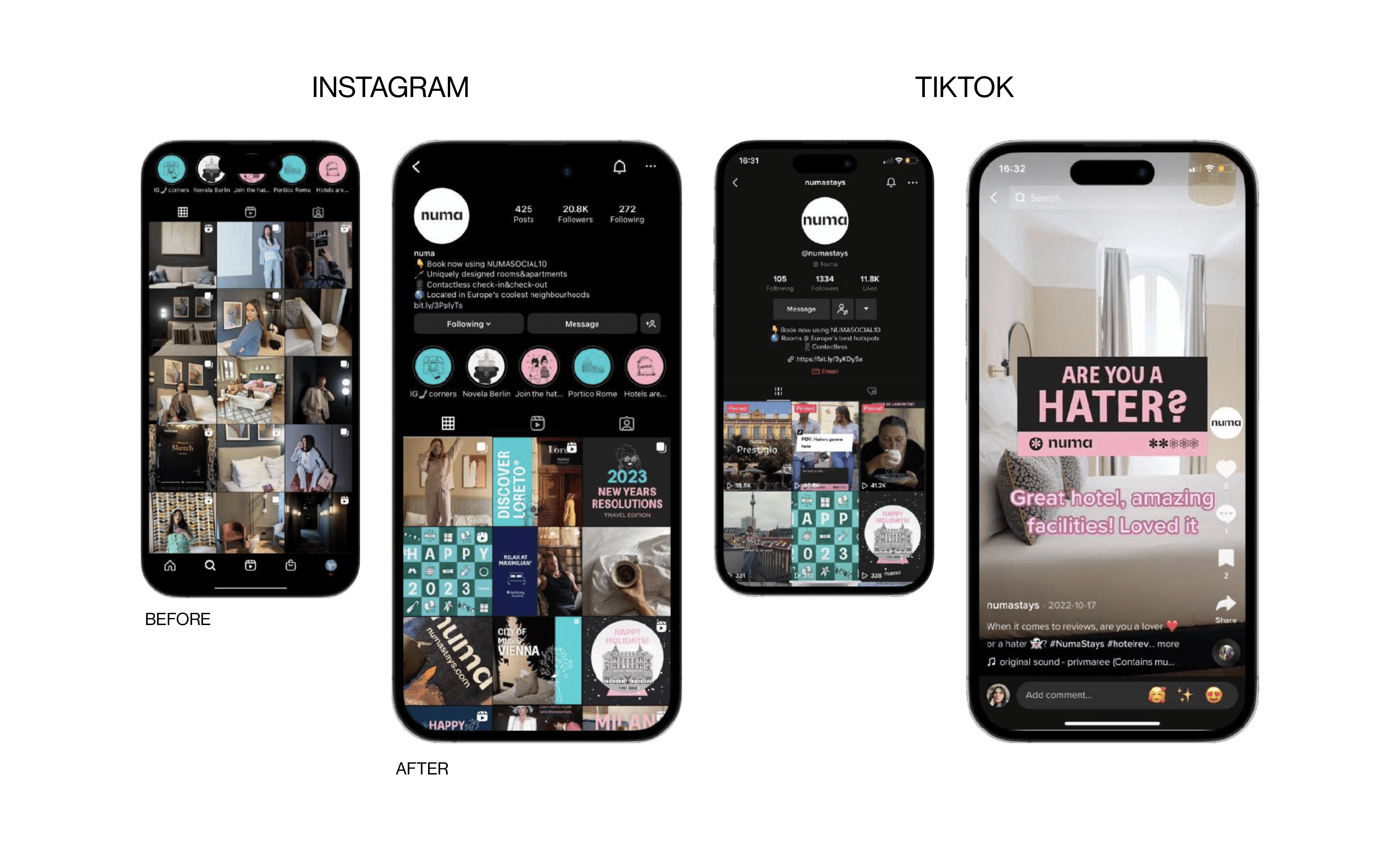
We also developed layouts for press release spreads announcing new property openings, illustrated postcards and city guides as guest touch points, and produced engaging content for Numa’s social media channels. These projects allowed me to explore the brand’s visual language in diverse formats, always with a focus on clarity, personality, and consistency.
We also developed layouts for press release spreads announcing new property openings, illustrated postcards and city guides as guest touch points, and produced engaging content for Numa’s social media channels. These projects allowed me to explore the brand’s visual language in diverse formats, always with a focus on clarity, personality, and consistency.
We also developed layouts for press release spreads announcing new property openings, illustrated postcards and city guides as guest touch points, and produced engaging content for Numa’s social media channels. These projects allowed me to explore the brand’s visual language in diverse formats, always with a focus on clarity, personality, and consistency.