ADRIA INTERIORES
ADRIA INTERIORES
KEYWORDS / BRANDING / ARCHITECTURE / INTERIOR DESIGN / MEXICAN / ELEGANT / EXPERIMENTAL / LOGO DESIGN / BRAND IDENTITY

THE CLIENT
Adria Interiores is a boutique interior architecture studio based in Monterrey, Mexico, founded by Adriana in collaboration with her close friends and fellow architects. Together, they specialize in designing sophisticated residential and commercial spaces that blend elegance, comfort, and functionality. Their approach is rooted in a deep understanding of each client’s unique lifestyle and vision, with every project tailored to reflect a sense of harmony and timeless beauty.
Taquería Madre celebrates authentic Mexican cuisine in an elevated way while carefully crafting their dishes to share with friends alongside classic drinks.
Taquería Madre celebrates authentic Mexican cuisine in an elevated way while carefully crafting their dishes to share with friends alongside classic drinks. The owners, being Mexican, discovered that the international food scene in the beautiful city of Berlin is amazing, but the mexican cuisine is lacking attractiveness and authenticity.
When approaching the branding process, the founder shared her inspiration drawn from editorial aesthetics, European minimalism, and the refined, understated luxury found in design studios based in cities like New York and London. They envisioned a brand identity that would feel mature, clean, and elevated—one that would echo the calm, balanced energy they infuse into their interiors, while still feeling approachable and modern.
Taquería Madre celebrates authentic Mexican cuisine in an elevated way while carefully crafting their dishes to share with friends alongside classic drinks.


THE OBJECTIVE
The primary objective was to create a brand identity that visually communicates Adria Interiores’ design ethos: timeless, intentional, and refined. The branding needed to convey a strong sense of professionalism and elegance, while also highlighting the studio’s warm, personalized approach to interior architecture.
The primary objective was to create a brand identity that visually communicates Adria Interiores’ design ethos: timeless, intentional, and refined. The branding needed to convey a strong sense of professionalism and elegance, while also highlighting the studio’s warm, personalized approach to interior architecture.
Develop a brand identity, collaterals and a website that harmoniously and effectively communicates the taquería's value and experience to Berliners, as well as the Mexican
view of the taco as something "holy".
It was important to establish a visual language that would resonate with a discerning audience, positioning Adria as a studio with both creative depth and high-end appeal. The identity also had to reflect their attention to detail and commitment to creating spaces that are not only beautiful but livable and meaningful to their clients.
Through the brand's behavior, typography and color story, the essence of true authentic Mexican taquerías is captured in an elevated way. Taquería Madre seeks to be a place where you can enjoy a genuine Mexican experience and share classic drinks with friends.
Through the brand's behavior, typography and color story, the essence of true authentic Mexican taquerías is captured in an elevated way. Taquería Madre seeks to be a place where you can enjoy a genuine Mexican experience and share classic drinks with friends.


THE SOLUTION
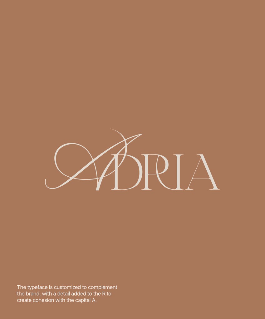
The final brand identity was built around a sophisticated visual system inspired by editorial design principles, luxury print publications, and timeless European aesthetics. The custom logotype combines delicate serif typography with expressive, high-contrast flourishes, creating a memorable and graceful wordmark that speaks to the brand’s elegance and precision. A muted, earthy color palette—featuring deep browns, warm neutrals, and soft gold accents—
The logo is composed of a wordmark,
mixed in 2 different fonts inspired by street taquerías of various regions in Mexico. Their communication and collaterals tend to be very rough, rustic and sometimeshandmade. The brand illustrations and colors are a
user-friendly way of depicting how vibrant the food is, and how much Mexicans put tacos, chiles and mezcal in a pedestal.
The logo is composed of a wordmark,
mixed in 2 different fonts inspired by street
taquerías of various regions in Mexico. Their communication and collaterals tend to be very rough, rustic and sometimes handmade. The brand illustrations and colors are a user-friendly way of depicting how vibrant the food is, and how much Mexicans put tacos, chiles and mezcal in a pedestal.
was chosen to evoke a sense of grounded luxury and complement the natural materials often featured in the studio’s interior work. Across digital and print applications, minimalist compositions and structured grid layouts were used to convey clarity and calm. The overall identity achieves a balance between modernity and tradition, supporting Adria Interiores’ mission of designing spaces that feel both contemporary and enduring.
The Typefaces used are modified in the wordmark, originating from the act of street vendors modifying and adapting graphic elements and fonts to their needs, sometimes without contemplating if it's correct or not. On the restaurant's communication and website, we aim to reflect the personality of this culinary experience, all while carefully considering the target audience and their needs. Details and simplicity are key in taking this into action.
The Typefaces used are modified in the wordmark, originating from the act of street vendors modifying and adapting graphic elements and fonts to their needs, sometimes without contemplating if it's correct or not.
On the restaurant's communication and website, we aim to reflect the personality of this culinary experience, all while carefully considering the target audience and their needs. Details and simplicity are key
in taking this into action.